


Color and Light: Basic Concepts
Analysis of an Andrew Wyeth portrait

This week in my new course called Intermediate Painting: Color and Light, my students and I looked at basic concepts of light, shadow, and color to develop a better understanding of the painting of light.
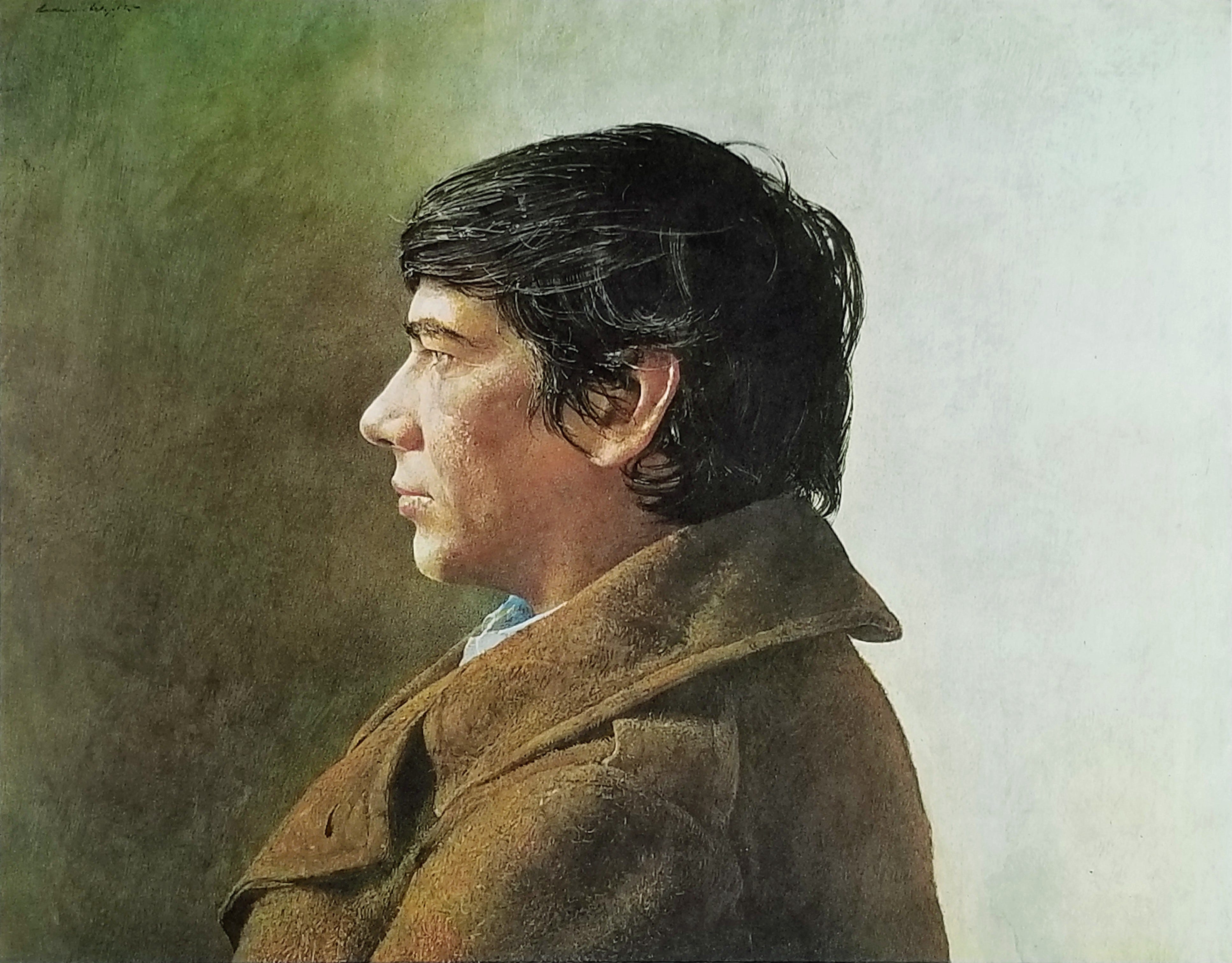
Let’s put theory to work and do a practical analysis of a real painting, Buzzard's Glory, a tempera by Andrew Wyeth painted in 1968. How did he do it? I can’t guarantee a perfect answer to that, but I’ll give it my best shot.
Squint
I asked my students to squint and try to perceive first the masses of light and shadow in their subject, whether it be a portrait, a landscape, or still life. If Buzzard’s Glory were pushed into a notan pattern of total black and white, what might it look like?
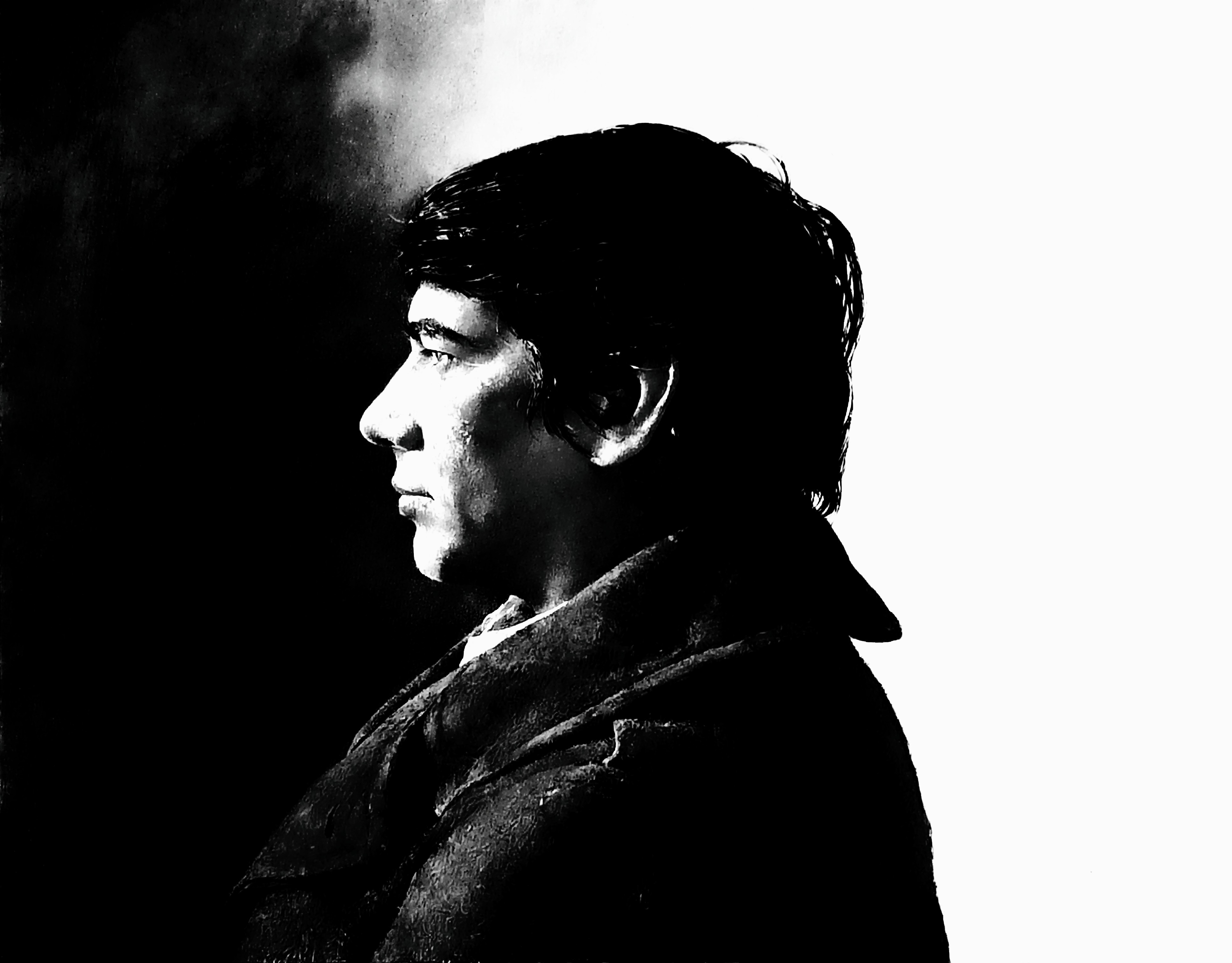
In the black and white version of the painting we can see that the background area splits into about 1/3 dark on the left, and 2/3 light on the right. There’s an inverse relationship with the values of the head: light shape (face) against the dark and dark shape (hair) against light. Notice when you squint, how all dark masses fuse into one, larger shape? And the light ones into another? Try to see these larger shapes of fused darks, and fused lights, rather than look for “head” “hair” “coat” and so on.
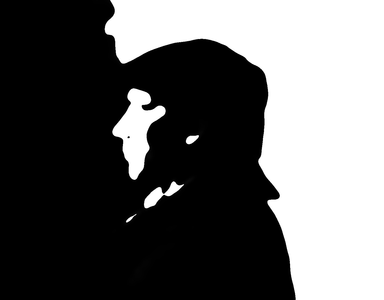
Let’s strip the image of its literal origins even further, abstracting it in big dark and light shapes. This is the way an artist might strive to see the composition early in the drawing process. If the composition is strong, balanced, and pleasing in this stage, it will be strong in the finish as well. This is essential for a good understanding of basic composition and lighting.
Once we have established primary light and dark shapes, we can refine and seek out subtle parts of light and shadow. It helps to know what those things are. Below is a diagram explaining the basic parts of light and shadow.
Parts of light and shadow
In creating this image of a shaded sphere, my first step was to establish masses of dark and light just as explained above in the portrait analysis. Behind the terminator (the borderline between dark and light) is the form shadow, and on the ground is a cast shadow. Initially I treated these two shadow parts as a single, connected, dark mass.
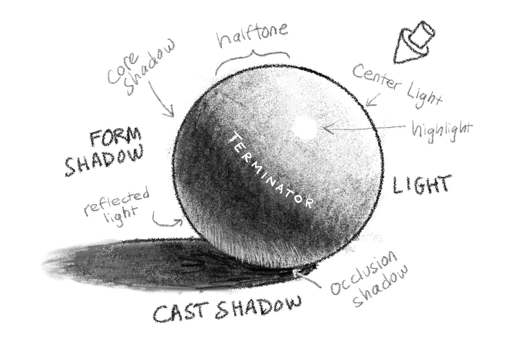
On the light side of the form I softly shaded the half light or half tone that moves toward the center light closest to where the light source is. On a shiny object there will be a bright highlight— a reflection that moves in relationship to the viewer’s eye (about halfway between the eye and the light source).
I next softly deepen the form shadow behind the terminator, to create a core shadow trapped between the main light source and the bounced light or reflected light coming off the ground surface.
I must not forget to deepen the cast shadow where it tucks beneath the object, forming the occlusion shadow. All the parts of light and shadow described on the spherical form are applicable to the portrait Buzzard’s Glory.
If this seems like a lot, keep in mind you are familiar with these parts of light and shadow in your everyday life, even if you didn’t know the terminology.
Color
Let’s look at color now. Remember that any color can be described using three variables: hue (the color of the color), chroma (the vividness or dullness of the color), and value (the lightness or darkness of the color).
Here’s Buzzard’s Glory once again. Notice in the original image on the left how the colors are rather muted (the chroma or saturation is low), but even these neutral colors have subtle hue identities. I’ve increased color saturation on the right to help show these relationships.
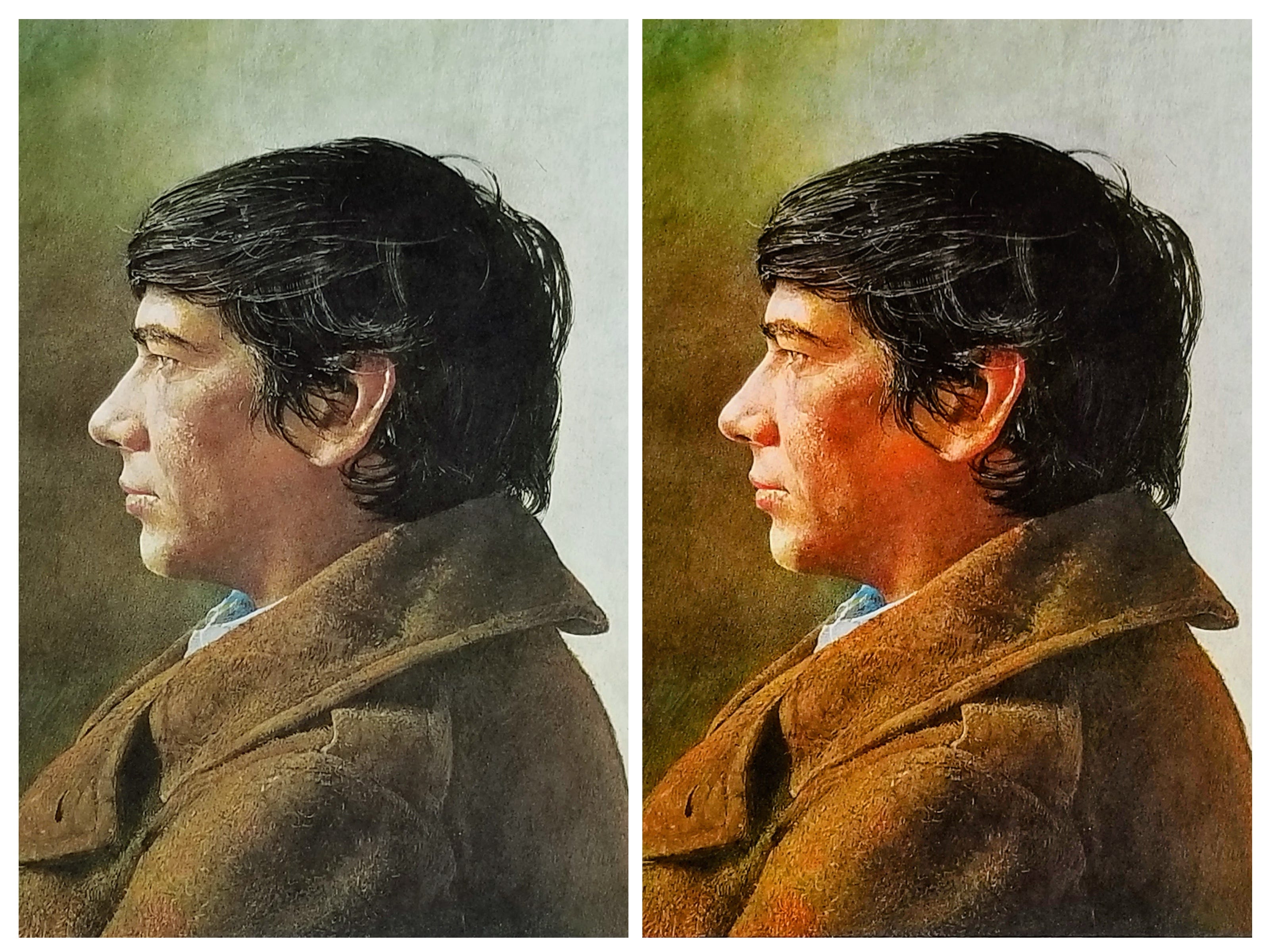
The portrait seems to be made primarily of oranges, greens, and neutrals. There’s a fleck of blue on the collar. The front of the face is a more of a yellow-orange, and the shadowed side leans more toward red-orange. Compare the coat to the face. Is the coat more yellow or red than the shadow side of the face? Can you see variations in blue-green and yellow-green in the top left corner?
Different color wheels
A color wheel is a handy tool to help us understand color relationships and color mixing. There are different color wheels that serve different purposes. For example, the “public school wheel” with red, yellow, and blue primary colors helps us understand color opposites, colors which become more neutral as they are mixed. The “YURMBY” wheel includes cyan and magenta for an expanded range of high chroma hues. Zorn’s portrait palette uses dull ochre for yellow and black in place of blue!
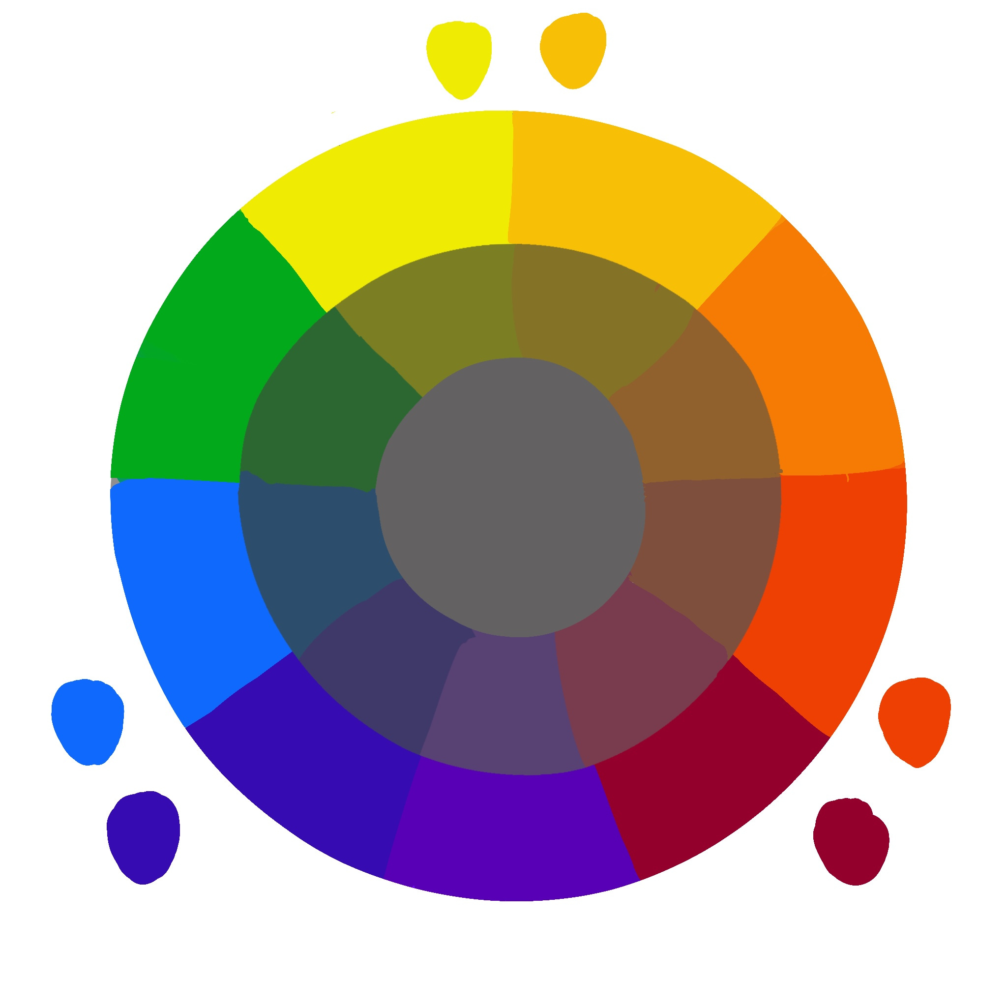
Double primary palette
The wheel shown above is a double primary color wheel. I’ll explain what that is, in a moment, but first, did you ever experience this: You mix red and blue to make purple, but get purplish brown instead? Or your yellow plus blue produces a color like old spinach juice? In these examples, instead of vibrant secondary mixtures, we got dull ones.
We already know that colors on opposite sides of the wheel, when mixed, will neutralize one another. If my blue+yellow is producing dull green, it stands to reason that somehow red got into the mixture. But how?
If you look at the primary colors in the double primary wheel you’ll notice there’s a cooler and warmer version of each primary color; this is how red got into my mixture! Ultramarine blue leans toward violet (it is a redder blue), and a warm yellow like cadmium deep also contains red. If I mix these to produce green, the green will be dull, because of the presence of red.
To produce vibrant mixtures, choose primary colors that are closer to each other and to the intended mixture. For example, a yellow-leaning, warm red like vermillion and a warm, red-leaning yellow like cadmium yellow deep, will likely produce a nice, juicy orange. Make sure your water, brush, and palette are very clean.
Vivid colors aren’t inherently better than dull ones; in fact you’ll need to use many subtle neutral colors if you want the occasional full chroma color to really pop. The illusion of light in a painting is dependent on this interplay of dull and vivid colors, and a strong, underlying sense of value.
Suggested practice
Try analyzing a painting and imagining how you’d copy the lighting. How would you push everything to be just two values: either dark or light? What about adding a third and fourth value (light and dark gray)? Try making a little thumbnail sketch of a master painting, simplifying it into three values, max.
What hues do you notice? Are they warmer or cooler versions of those hues? Are they neutralized with some complementary color perhaps?
Have a look at artist Lena Rivo or James Gurney, both masters at capturing light and color in paintings.