


Gouache and the Illusion of Light
Workshop notes with expanded section for paid subscribers.

Last Saturday my workshop guests and I tackled a big topic—how to paint the illusion of light using gouache. Here are tips for painting realistic-looking light, with an expanded section for paid subscribers of Artist’s Cheat Sheet.
How to use gouache
My always-free article Gouache Basics Painting Lesson covers this. Basically, gouache acts as an opaque watercolor when mixed to the consistency of melted ice cream. It reactivates easily when wet, so layering requires quick, decisive action (unless you want to mix layers of colors in your painting).
Strong, direct sunlight
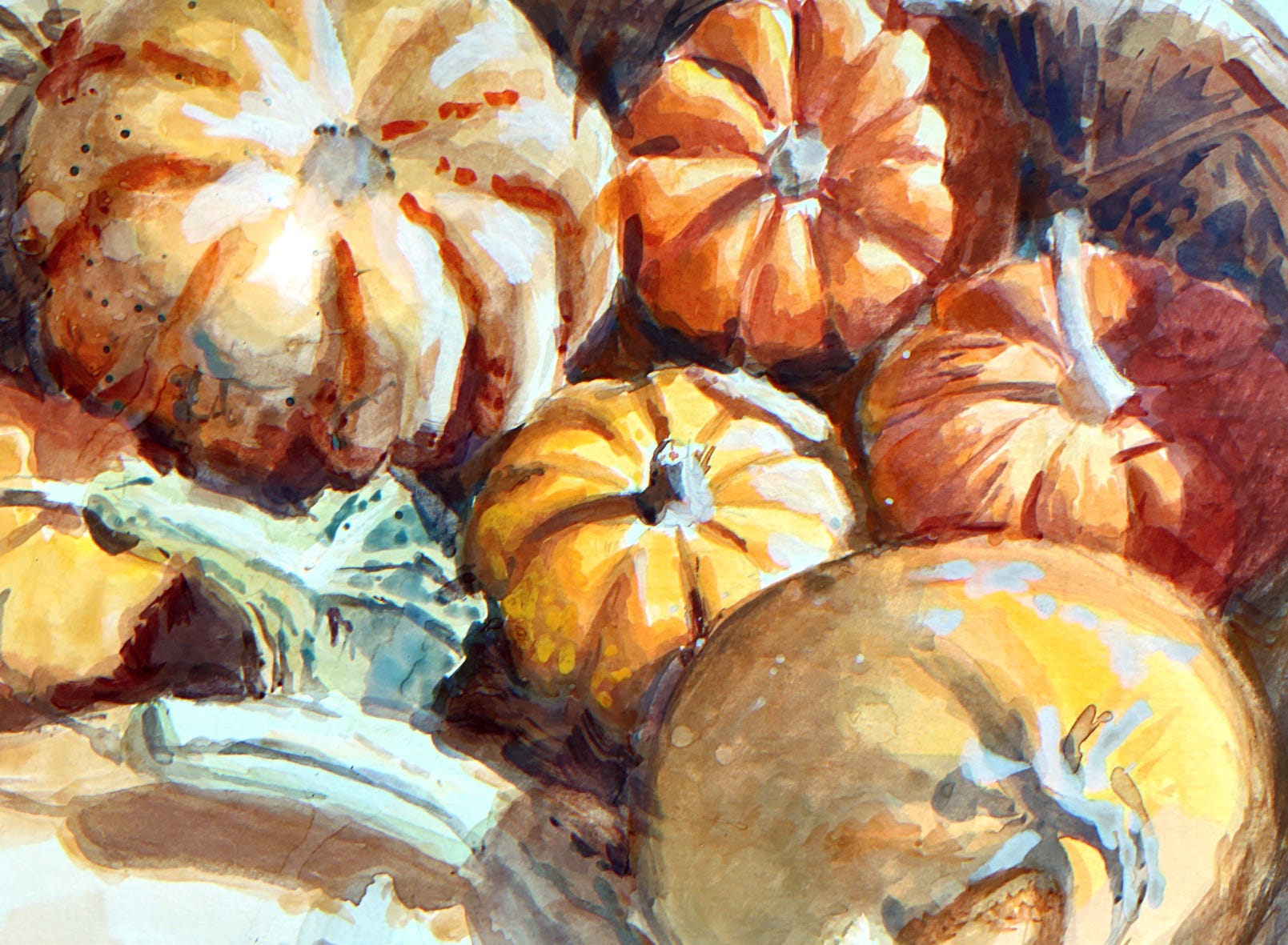
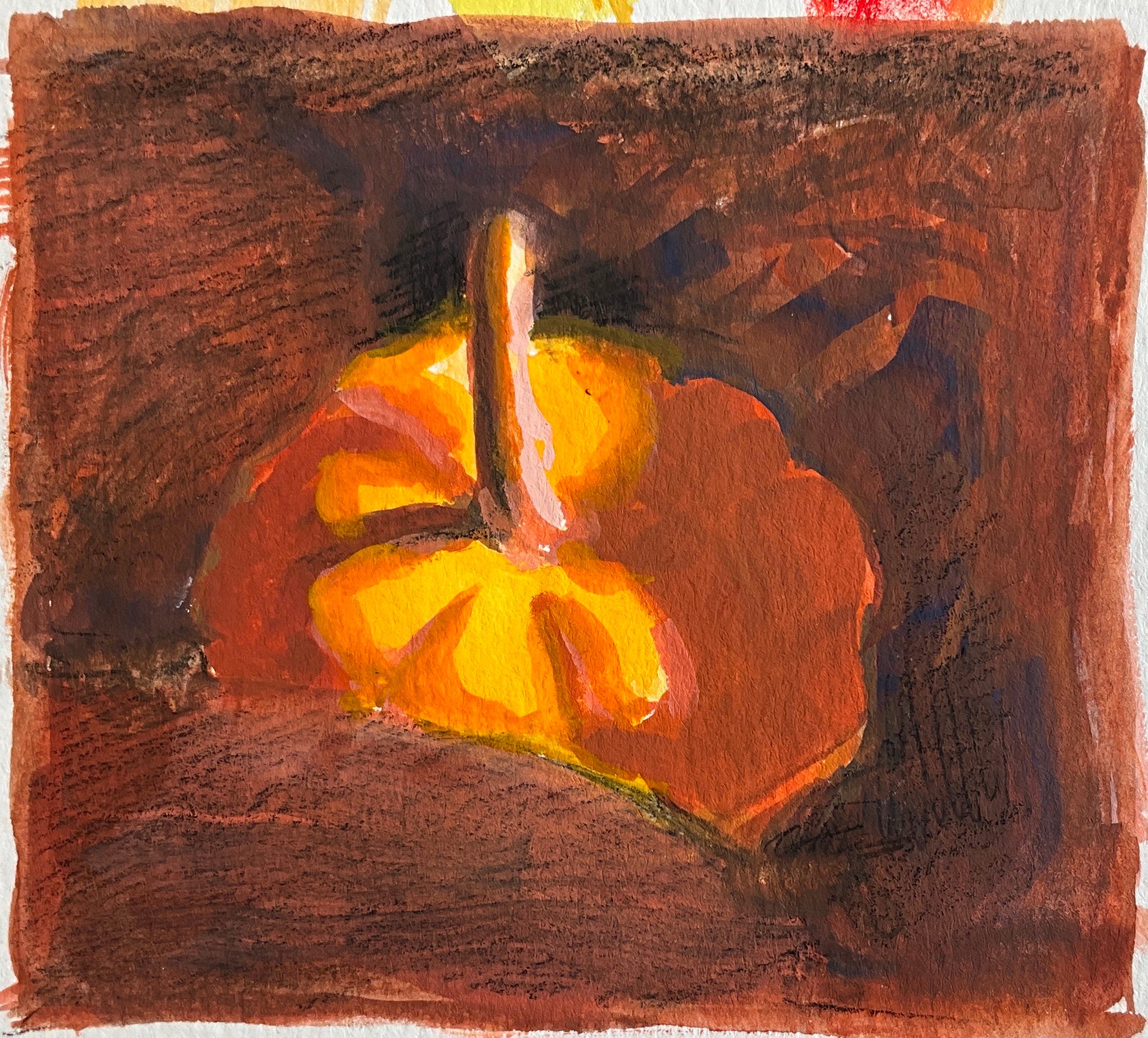
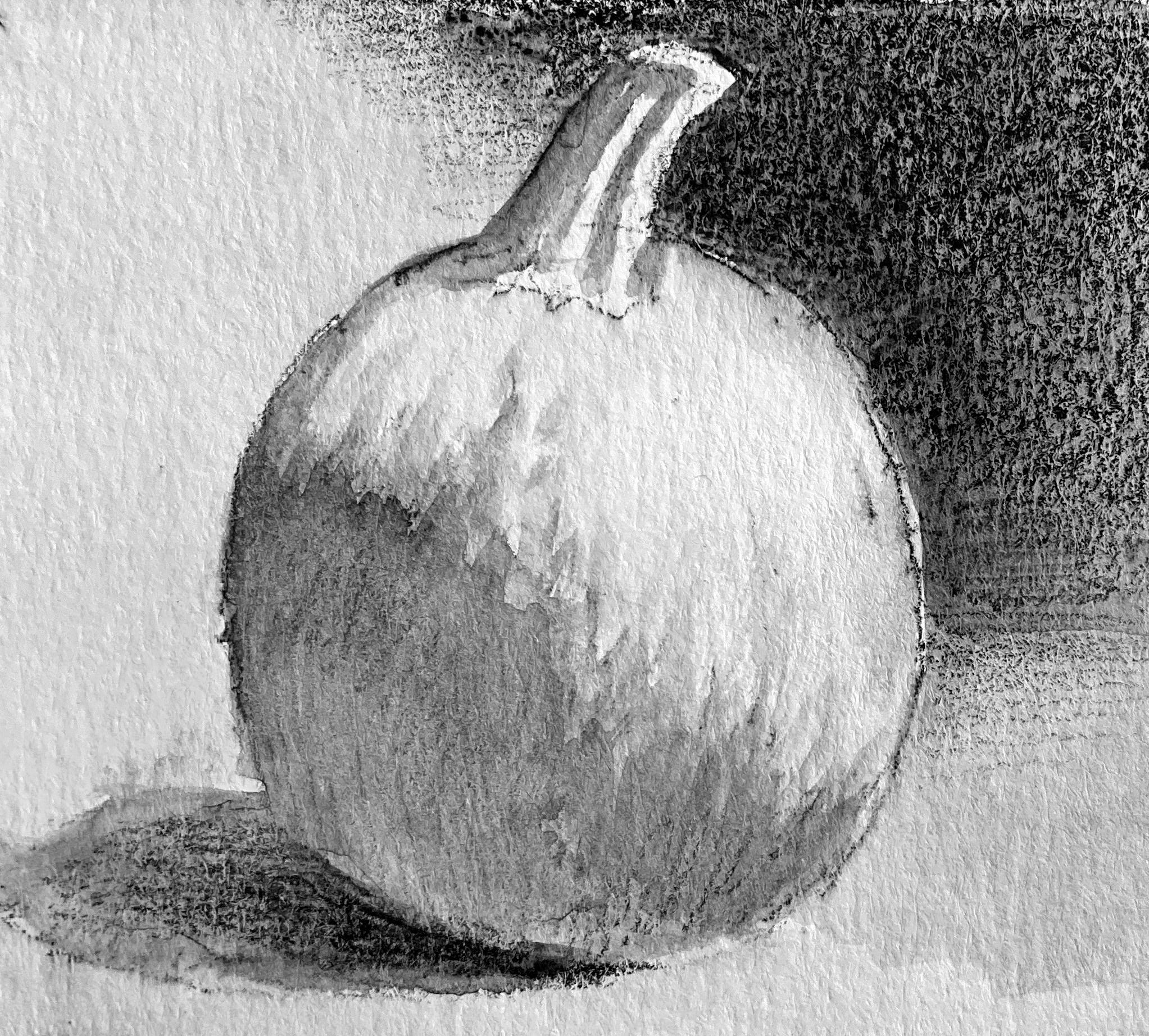
“Light” can mean so many different things—the soft, warm glow of golden hour; harsh, cold lighting inside a big box store; diffuse, gray haze on an overcast day. There are too many different lighting scenarios to list here, so let’s focus on one of the most common: bright, warm light and cool shadow—in other words, sunlight.
Class worksheet
The worksheet below covers foundational concepts regarding the behavior of light on three basic forms (ball, cylinder, box); the three parts of color; and how the three parts of color shift as they move into shadow.
Let’s go over each section first, and then put it all together.
What’s the shape?
Light creates predictable patterns of illumination and shadow when falling across balls, boxes, cylinders. Try to imagine what the component parts of your subject are in these simplified terms. An egg will follow the rules of shading a sphere; a handrail may be boxy or cylindrical.
Read more about shading a sphere.
What’s the light source?
Take a moment to understand why light falls across your subject the way it does. Where is the source of light? Is it cool or warm light? Is there a secondary, weaker source of light as well?
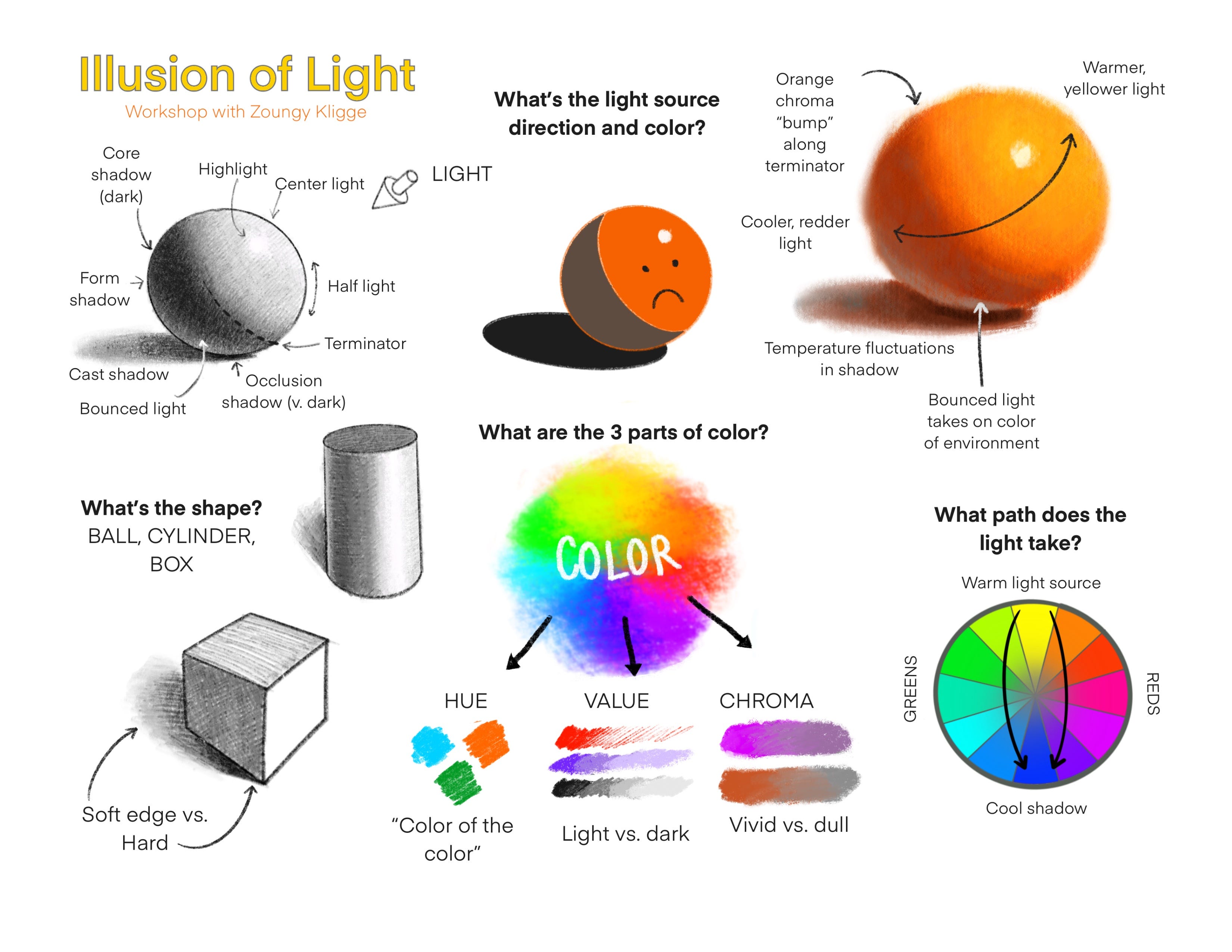
Three parts of color: hue, chroma, value
The three basic building blocks of color are hue (“the color of the color”), chroma (saturation or dullness) and value (lightness or darkness). These are the tools available to us to create convincing light effects with paint.
Hue
I find it helpful to name the hue as a starting point for color mixing: red-orange, red, blue-green, etc. (Neutral colors are harder to identify. Look for other grays/neutrals to compare.)
Mix neighboring colors on the color wheel to shift the hue warmer (toward the light) or cooler (toward the shadow).
Grays, hues, and color temperature
Sometimes grays look like warm hues (when seen in an overall cool context) or cool (when seen in an overall warm context). Gray in a mostly-cyan painting might appear reddish, if it is the closest thing in the painting to red.
Chroma
Use pure, clean paints for high-chroma (vivid) areas.
To reduce chroma/darken, mix in a hue from the opposite side of the color wheel (a complementary color).
Reduce the chroma of a color without making the color simultaneously go darker by mixing in gray that matches the value of the color.
Complementary paints become duller when mixed together because they share no wavelengths in common, resulting in less light reflecting back.
Two complementary lights (like on a stage) mix to a brighter, whiter light because they cover all wavelengths when added together.
Value
White and black can change a color’s value, but also drastically lower the chroma (since neutrals like white and black have no chroma).
A gentler approach is to darken/dull with a complementary color or a deep color; and lighten with a pale, chromatic color.
Practice mixing colors
Attempt to alter any one of the three parts of color, and other parts may shift as well. It takes some practice to accurately mix your target color. It may seem overwhelming, but I can say truthfully that my workshop students were doing a great job after just a couple hours of practice.
What path does the light take (across the color wheel)?
Why does sunlight look yellow, and shadow look blue?
Sunlight is pure white light, containing the whole spectrum of color within it. Due to an atmospheric effect called Rayleigh scattering, blue wavelengths are filtered, making sunlight appear yellowish.
In yellow light, shadows are perceived as cool because 1) warm light naturally contrasts with cool shadow and 2) the blue dome of the sky acts as a soft, secondary light that fills in shadow areas.
On the journey from sunlight to shadow, colors become not only darker and duller, but cooler and less yellow (more on that in the paid bonus section below).
Inspiring gouache artists
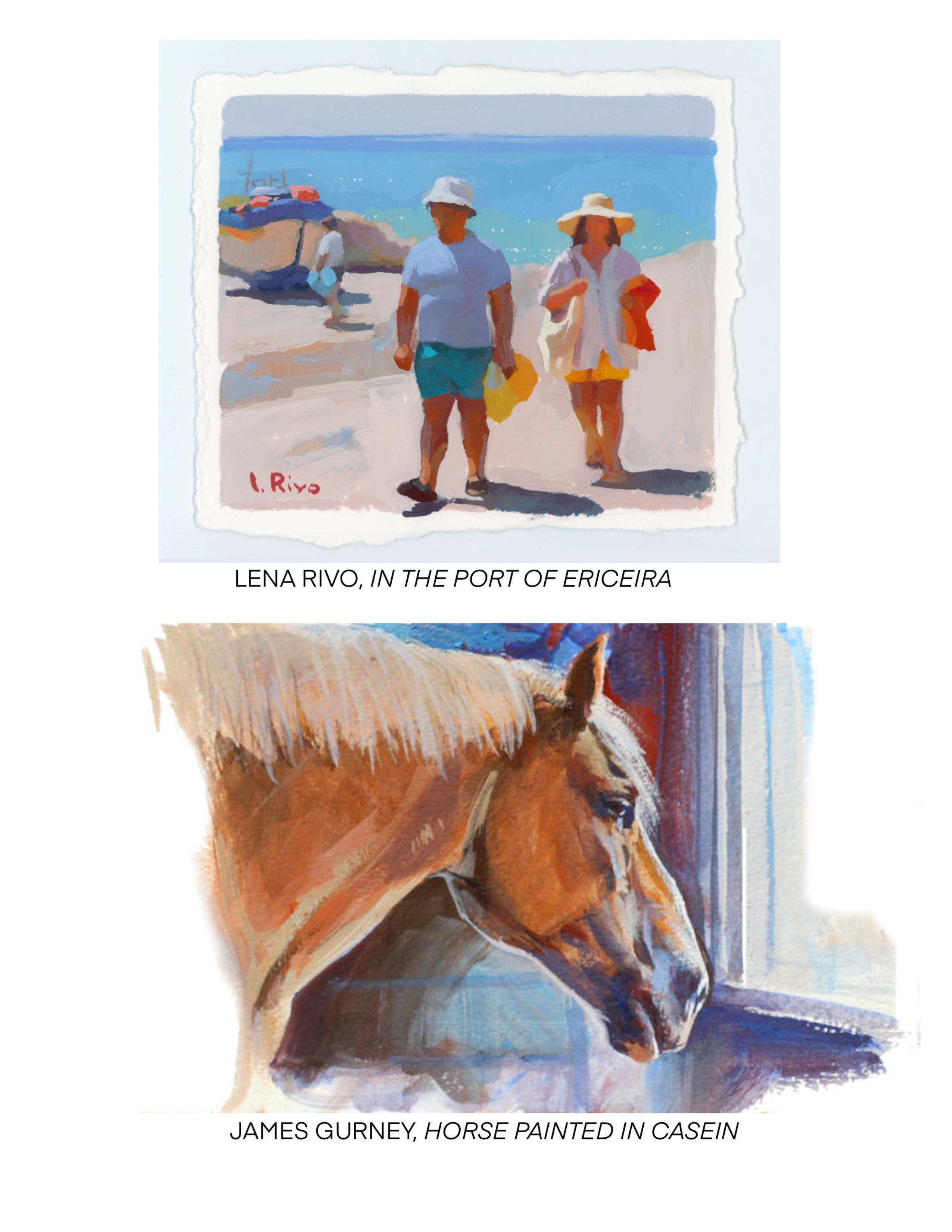
I mentioned two gouache artists in class, although there are many great ones out there who have the ability to portray light beautifully.
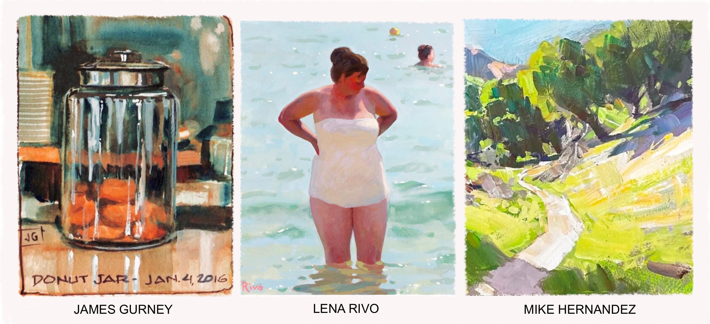
Some great gouache artists, many of whom share free educational material in addition to paid content:
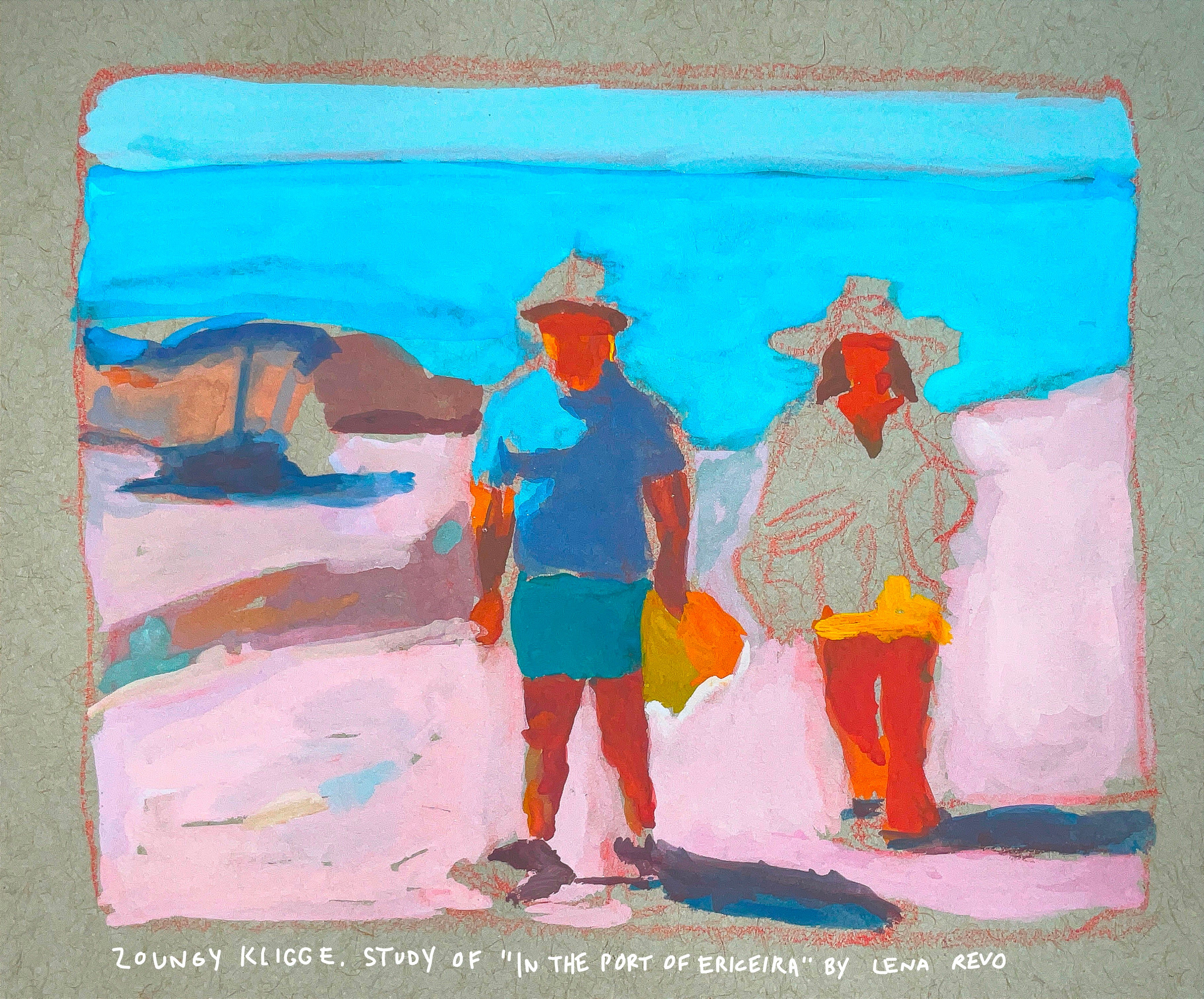
Lena Rivo (masterful with light; free resource guides)
James Gurney (author of Color and Light; extensive YouTube and Substack)
Justin Donaldson (plein air landscapes)
Mike Hernandez (landscapes, urban sketching)
Gil Robles (portraits)
Tiffany Mang (plein air and miniature landscapes)
Gary Geraths (urban sketching)
Mary Blair (1911-1978; stylized, colorful, mid-century illustrations)
Putting it all together
We need to consider everything mentioned on the worksheet—shape of the subject, light source, and how hue, value, and chroma shift as they move from light regions into shadow. For paid subscribers, I further describe below how it all comes together to create the feeling of real light.
I also wrote more about this in my article called How To Fix a Weak Painting.
Read on for less than the cost of fast food (plus, you’ll be able to read everything else on here—a real “value meal”). Small contributions keep this independent publication running—I thank you!
Keep reading with a 7-day free trial
Subscribe to Artist's Cheat Sheet to keep reading this post and get 7 days of free access to the full post archives.