


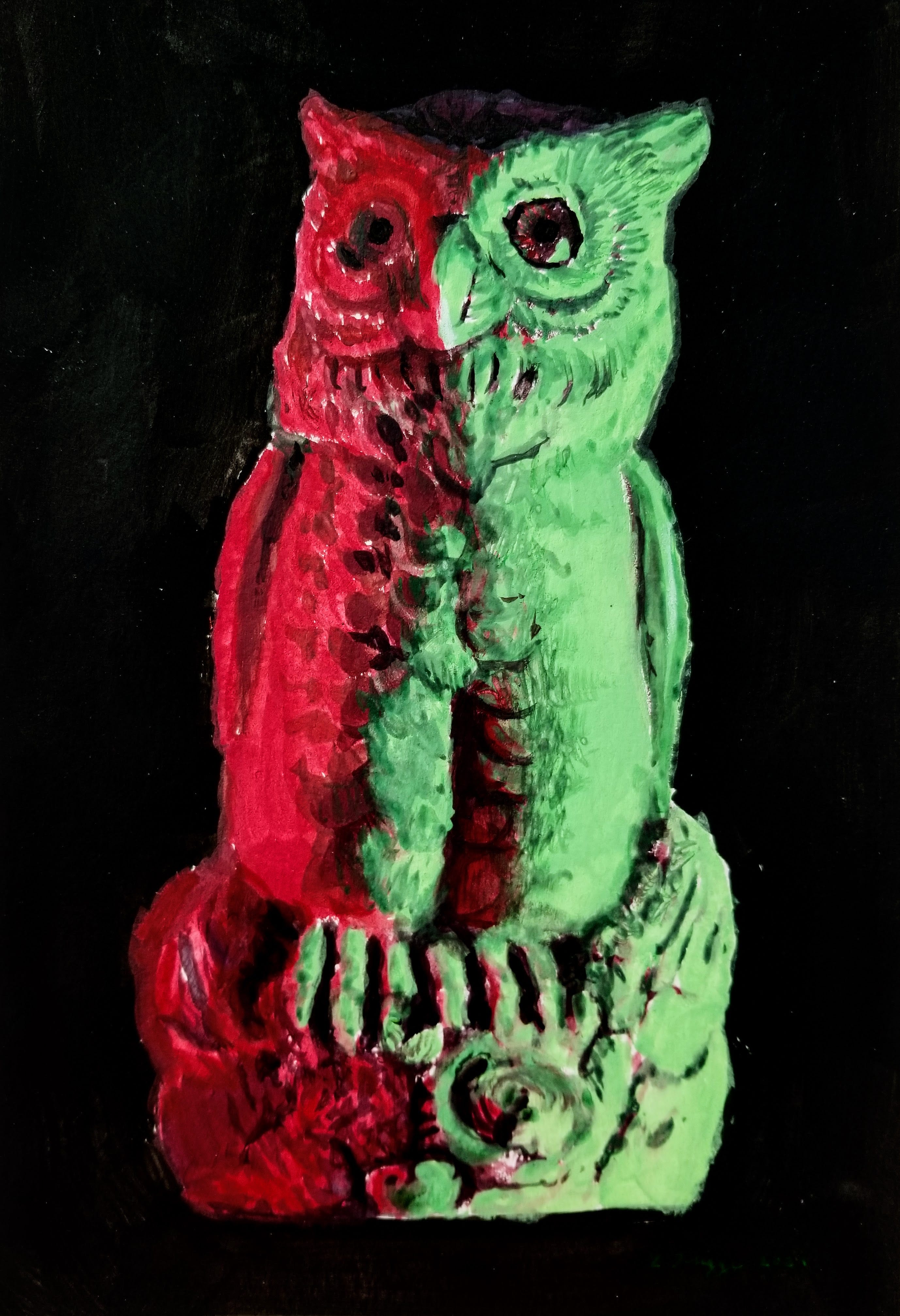
Owl Painting: Two Colored Lights
Gouache painting of an owl with contrasting colored light sources.

Today I’ll explain how I painted this plastic owl illuminated by contrasting, colored light sources. This was a live gouache demo for my intermediate painting students. In the class notes below, I’ll cover:
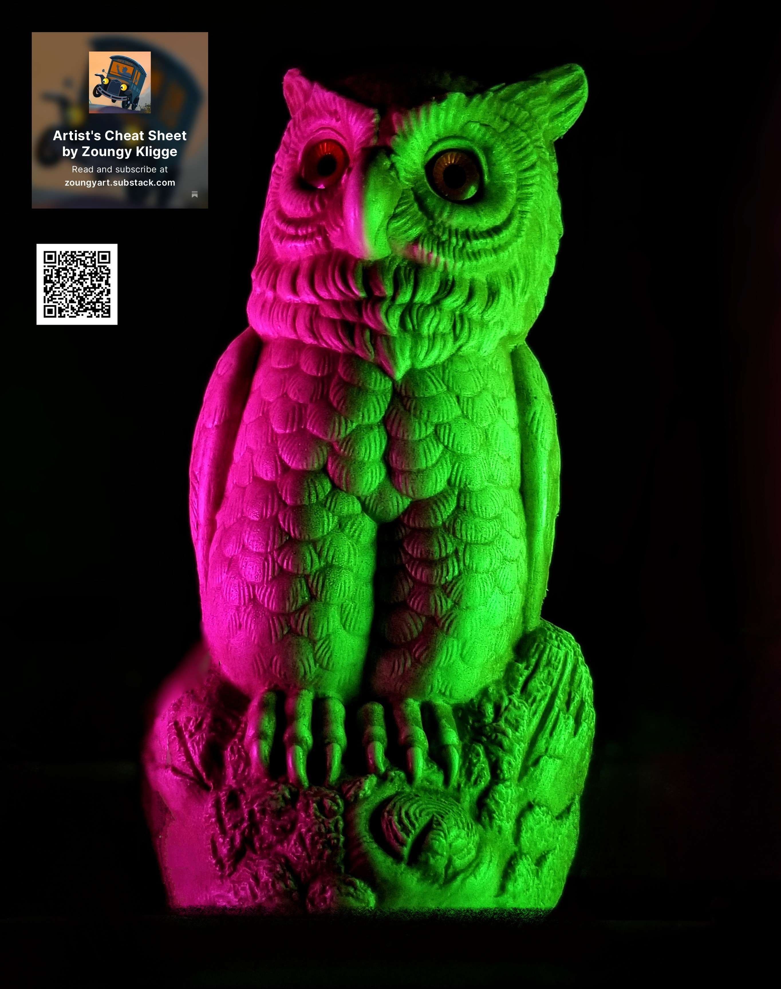
How to easily shoot your own reference image (owl reference photo is included)
The illusion of colored light in paint
Limitations of paint pigments
Additive vs. subtractive color mixing
Summary of painting process (read about how to use gouache here).
Students who are currently enrolled in any of my courses have complimentary Paid Membership to Artists’s Cheat Sheet, and ALL Paid Subscribers can access my class notes and the searchable Archive. This paid post includes a free preview for all Free Subscribers! Let’s get going!
Create a reference image
I have included the un-watermarked owl reference image at the end of this post for my Paid Subscribers, but you can create your own reference relatively easily:
Use two digital devices— set to maximum brightness— as contrasting, colored light sources, and a windowless room such as a bathroom as a studio. Illuminate your chosen model from the left and right, and photograph it with a smart phone. Finish with contrast adjustment and touch ups on photo editing software like Google Photos app.
Illusion of light, limitations of pigments
Looking at the reference image, we can see and think of the two different color areas almost as separate paintings. On the magenta side, note that the highest chroma might be represented with a “rose” colored paint (a purplish red). Check your paint box for the best candidate.
On the green side we will need a pale yellow-green for the highest chroma parts. On both sides it’s important to note the limitations of the pigments— we can’t push beyond the highest chroma and value available to us; we can only reduce chroma and value of adjacent colors for contrast. This is a key point.
The colors available to us only appear more vivid, because surrounding color has been reduced in chroma and value.
During my class demo, I showed what happens when titanium white is used to brighten the magenta. It doesn’t work. The chroma falls off dramatically, and we end up with a lighter, very grayish red-violet. I skipped the white and used a mixture of a rose and slightly warmer red for my most vivid reds.
Keep reading with a 7-day free trial
Subscribe to Artist's Cheat Sheet to keep reading this post and get 7 days of free access to the full post archives.