

Self Portrait
Bringing together the right ingredients to make a convincing self portrait.

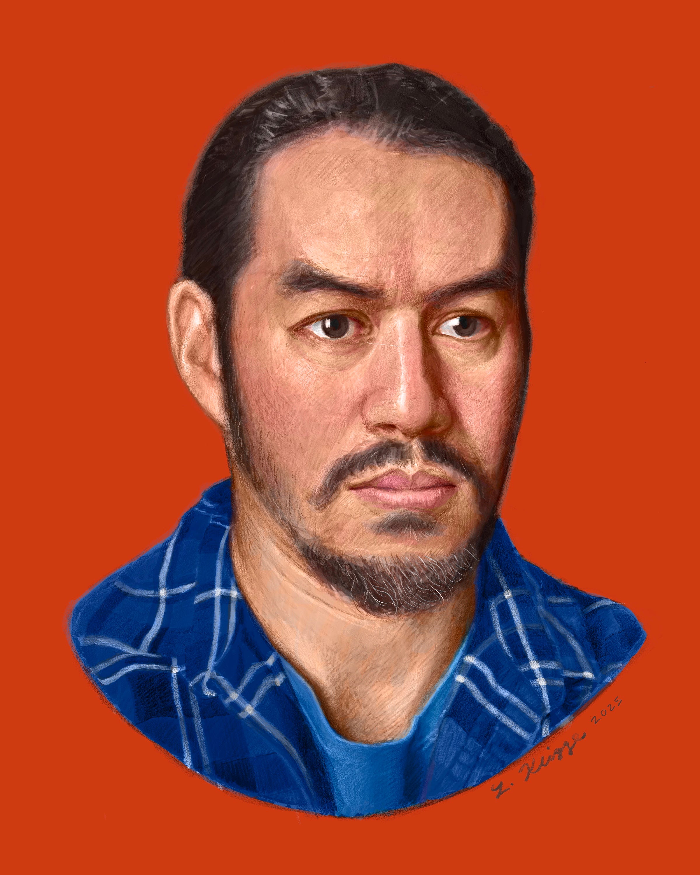
At some point I had to post this self portrait—but is it done yet? That’s to be determined. I might be tempted to fuss with it a little bit more. Here are some thoughts on making this image, and if you’re a paid subscriber (or a comp subscriber) you’ll get to see the time lapse video of how I made it further below.
As a paid subscriber, you can read my whole portrait series at this link. It includes lessons on how to draw the mouth, eyes, ears, and nose, and how to position the head and get proportions correct.
Start with proportions
I began by creating a reference photo of myself. It’s true that I could have worked from a mirror, and probably ideally I would have. But a reference photo is convenient in that my pose and lighting stay “locked in place.”
There are several basic, traditional lighting setups, which
conveniently describes in this post on his blog. I chose something in-between the three-quarter broad lighting setup and a frontal lighting setup.Next, using the Loomis head model I started drawing a simplified head with positions of major facial features and proportions marked.
Laying in tonal values
For the middle part of the process—probably the most time-consuming—I placed in my tonal values (dark and light shading).
It is especially important at this stage to check shapes for accuracy, and to make a clear tonal statement rather than get stuck in muddy mid-tones.
I chose to separate the tonal and color processes (my drawing and painting is done digitally). In physical media such as oil, acrylic, and watercolor, a glazing technique would be the equivalent of what I was doing digitally. Tonal value is established on one layer, and then translucent color is glazed on top.
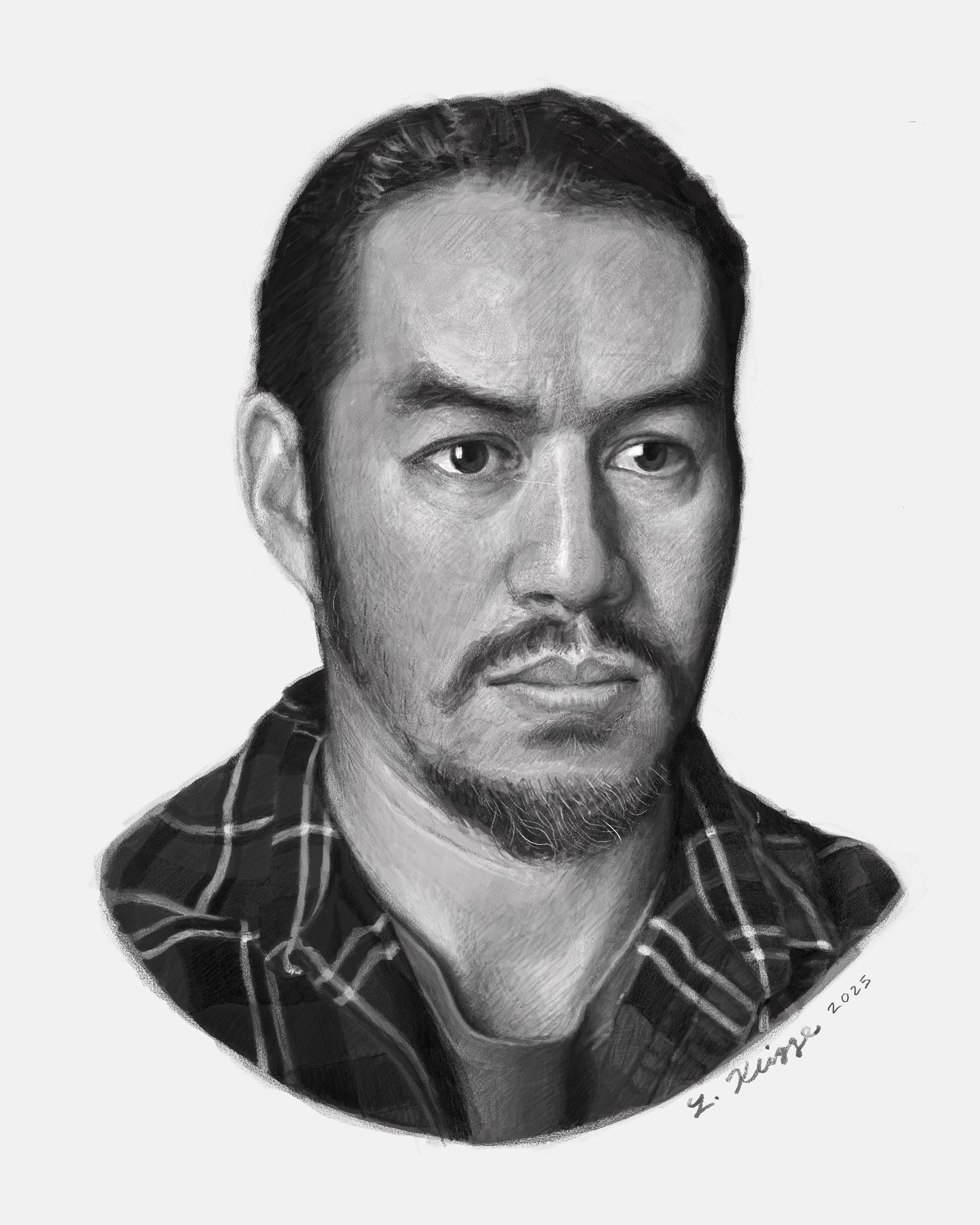
Which do you prefer? The color version or the black and white tonal version? I like both for different reasons, personally!
Finishing with color
In most digital painting programs you have the option to work on different painting layers and to choose how those layers blend and interact with one another.
In this case I created a color layer on top of the black and white layer and set it to Color Blend Mode.
I was then able to choose the hue and saturation of colors I wanted to paint with, without having to worry about tonal value (since that step had already been done on the black and white layer).
Some tips on color—The hair, while dark, is not simply black. There’s a dark, dull, slightly reddish tone. The face is a peachy color, redder where there is more circulation around the cheeks, nose, and mouth, more yellowish elsewhere.
Time lapse video
Become a paid subscriber to see a time lapse process video after the break—including how I established proportion early in the drawing process, then defined tonal values, color, and final adjustments.
Also check out my Linktree for in-person and virtual learning opportunities. Paying subscribers may qualify for discounts.
Keep reading with a 7-day free trial
Subscribe to Artist's Cheat Sheet to keep reading this post and get 7 days of free access to the full post archives.